#TidyTuesday - Taylor Swift
Another TidyTuesday iteration, “Taylor Swifts ‘Meta-oric’ Rise”! This figure makes use of the R package ‘taylor’, and plots the Metacritic score of each of Taylor’s albums, arranged chronologically. The ‘rings’ of each album are color coded to each albums unique color palette, and the number of rings correspond to the number of songs on each album.

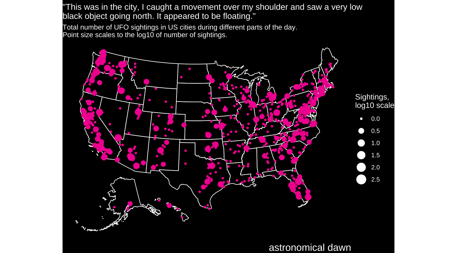
#TidyTuesday UFO sightings
Chart types: Stacked bar, pie, stacked area, and map gif.
Another stab at visualizing a TidyTuesday dataset using UFO sighting data over the USA. The first plot looks at sightings of “lights in the sky” and the prevalence of the six most common colors. The top panel shows relative abundance by State, the bottom pie chart displays the overall relative abundance of colors in the USA, and the bottom stacked area chart shows the number of sightings of each color binned by year. Note that the colors are labeled to the right of the upper panel, and the lower two plots follow the same order (counter-clockwise from top for pie chart; top to bottom for area chart).
The map gif shows the total number of sightings in the database for each city in the USA, binned by “day part” (i.e. dawn, dusk, night, etc.). Size of point scales to the log10(sightings) and the color changes according to specific day part, which is also displayed in the bottom right.

Recreating the “COVID spiral” plot for atm. carbon dioxide concentrations
In January of 2022, the New York Times published an opinion piece that was accompanied by a spiralized visualization of COVID-19 cases through time. Whether the figure was an effective, or attractive way to visualize that data was much debated in the Twitter-verse. In any case, as a fun side project, I went about trying to make a version of the plot that displayed some Earth Sciences relevant data and settled on the record of Atmospheric CO2 concentrations over the past 800,000 years. The results are shown here in the original, as well as three other color palettes. And yes, the modern time bin really is that much different.


#TidyTuesday NYT Crossword data viz
Tidy Tuesday is a community-driven weekly data project aimed at the R ecosystem. Each week a new open source data set is posted and the R community is challenged to come up with interesting ways to analyze and visualize the data. On one of those Tuesdays, the dataset was New York Time Crossword answers and clues, and I had enough spare time to join in the fun. For my visualization, I created a heat map that depicts the relative frequency that a specific letter is the first letter of the answer to a given clue number, binned by Across and Down clues. Unsurprisingly, S was fairly over-represented compared to most other letters, but there was also a surprising amount of structure to the data, such as the fact that C, D, and E tend to have higher proportions as the first letter of high-numbered Down clues. This was a really fun and edifying exercise that I encourage anyone who is learning R to try!

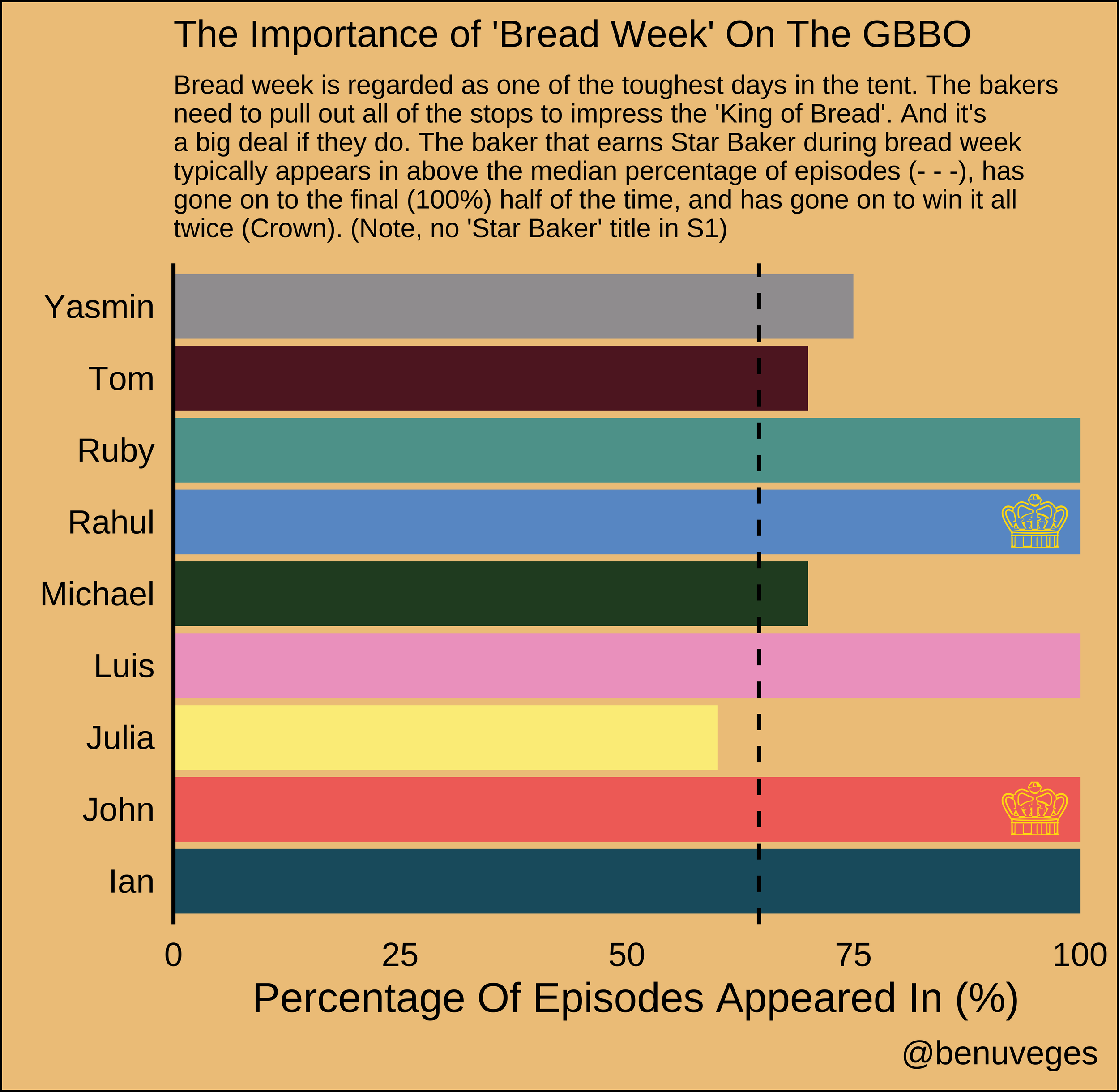
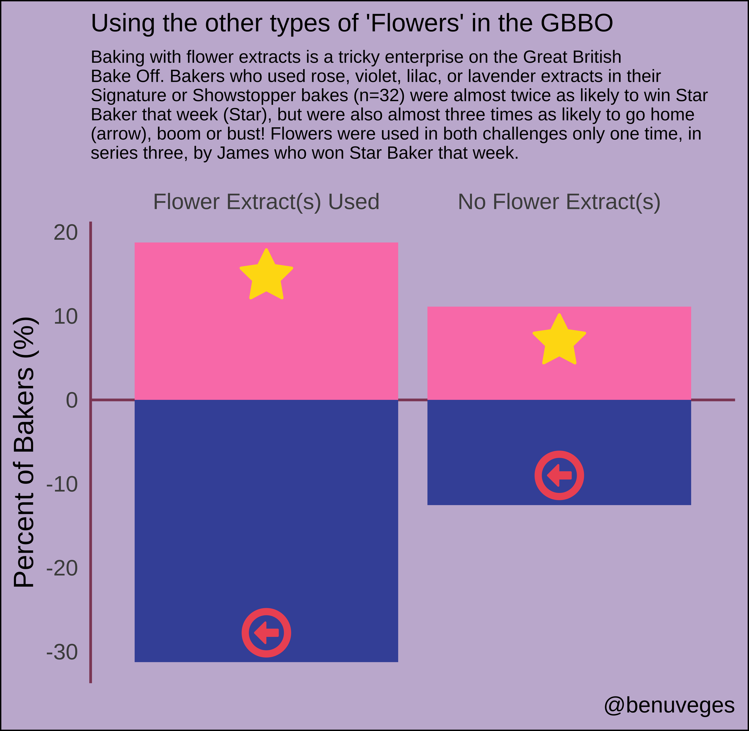
#TidyTuesday and the Great British Bakeoff
Another TidyTuesday data challenge, this time using compiled data from the Great British Bakeoff series. For this week, I took a look at two things my wife and I ALWAYS comment on when watching the show - "people who do well in bread week go far" and "rose/lavender is a tough flavor to balance right, they better be careful!". And it seems the data agree:
Bakers who get Star Baker in bread week generally last longer in the competition, and half the time make it to the final.
As for floral extracts, they are either boom or bust. Looking at the 32 times a baker listed a floral-flavored signature or showstopper, those bakers were twice as likely to win star baker, but also three times as likely to go home that week!
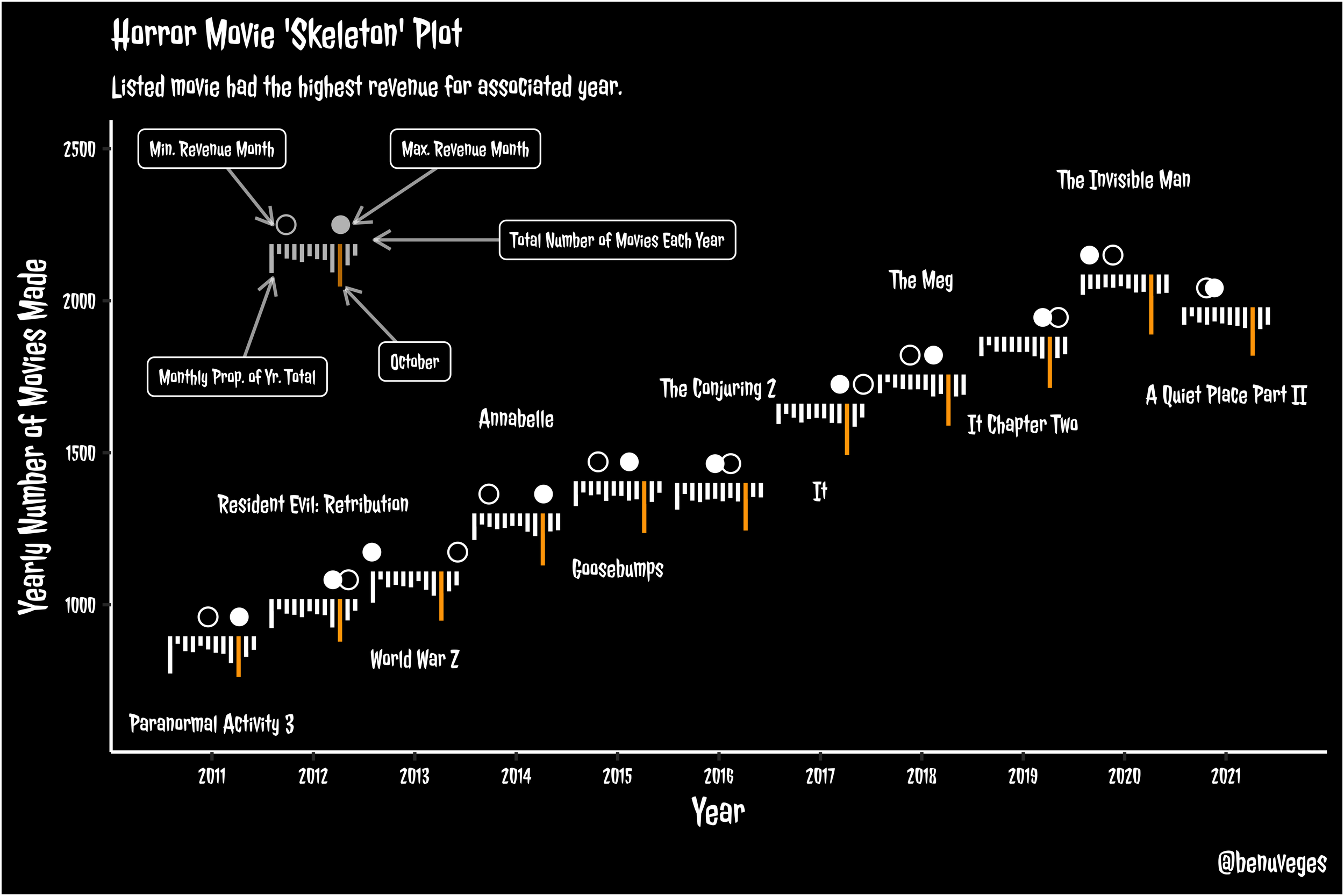
#TidyTuesday Watches Horror Movies
Chart type: 'Skeleton' - a combination of bar plots and points in a spooky arrangement Data: Total number of horror movies released per year. Bar plots, or 'teeth' represent proportion of movies released in a given month in each year, with October highlighted in orange. Circles, or 'Eyes', denote the months with the minimum (open) and maximum (filled) total revenue made from movies released that month.
In general, the number of horror movies made per year is has increased over the past decade. More horror movies are typically released in October than any other month (no surprise) usually followed by January (mild surprise there). The maximum/minimum revenue months do not always align with the months with the maximum/minimum release months.
Summons and Geofunkel
Just a goofy exercise in science and music puns using one of our group photos from my time in the Summons Lab.
